Description
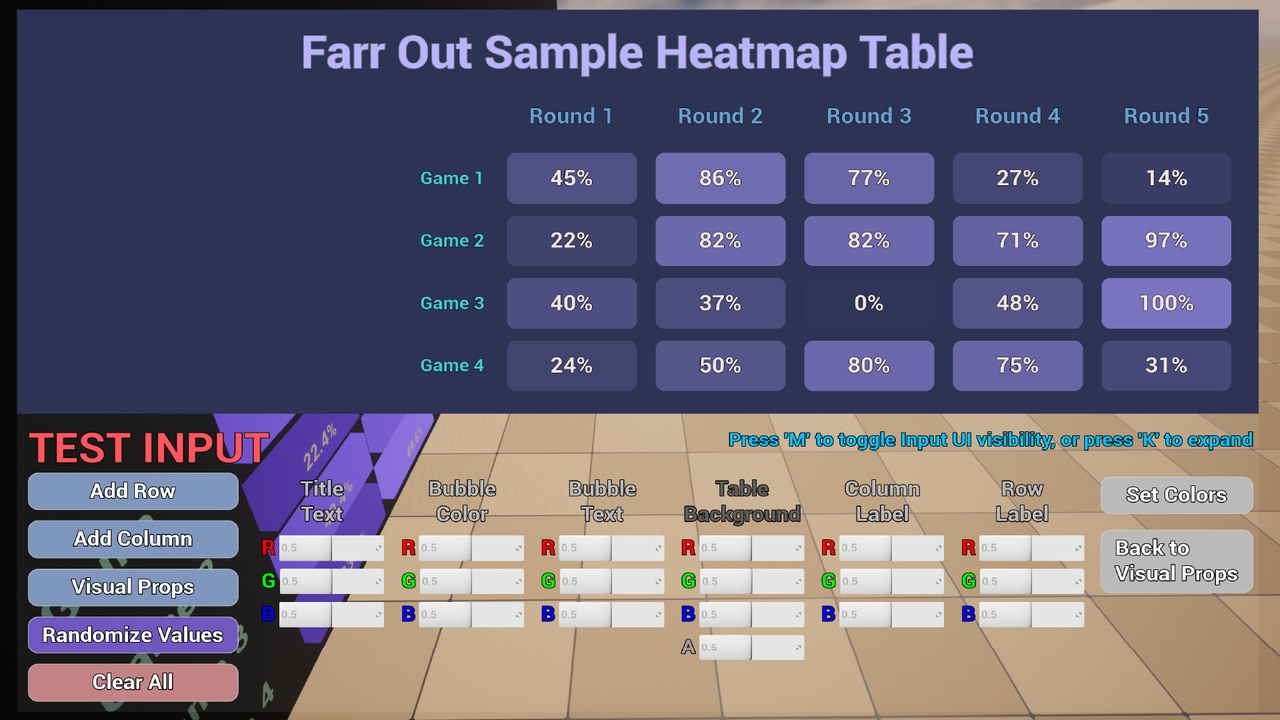
Using this tool is as simple as mapping your data to the heatmap data type, then this can be plugged into either or both the 2D and 3D charts. Since they use the same data type, you can very easily synchronize the chart data and animations!
Heatmaps are great for seeing relative quality of numerical data sets. This heatmap will automatically evaluate the value range of your set, finds the percentage of that range which is displayed on each bubbles, and then interpolates this value between the minimum and maximum opacity you set to determine the transparency of the bubbles.
Try it out free!
MacOS (Mac users may need to right click -> open to get the option to bypass security warning since this is unsigned)
Windows Tester COMING SOON
This chart can also be purchased as part of the Charts Pro Total Analytics - Starter Kit! This kit includes Bar Chart, Pie Chart, Heatmap Table, and Scatter Plot/Line charts. ($29.99)
SUPPORT: https://discord.gg/F4Yg2e5XVR | [email protected]