Beschreibung
Bring Photoshop-style effects to Unreal Engine UIs – soft shadows, glow, and more, instantly.
✨ showcase | 📖 docs
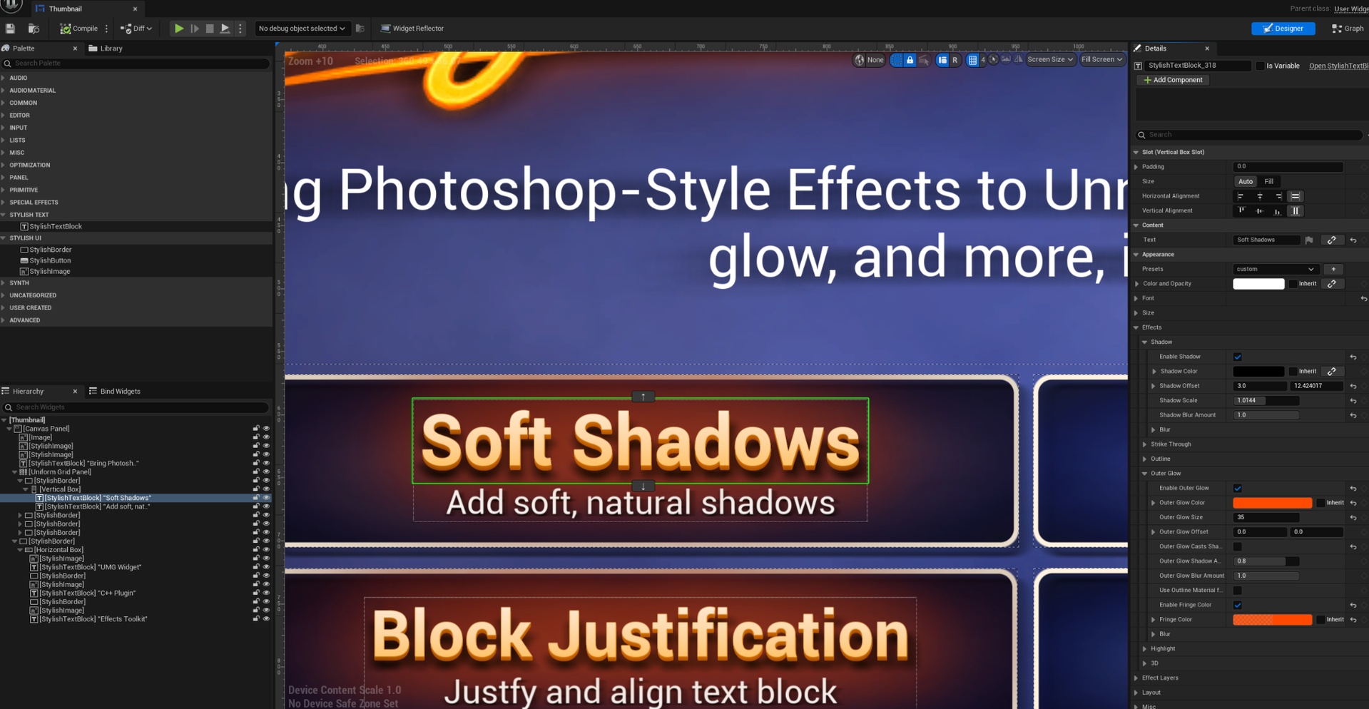
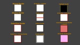
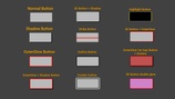
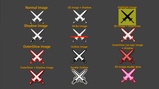
Stylish UI & Text is a UMG plugin that adds advanced visual effects to text and common UI widgets. It includes StylishTextBlock, StylishBorder, StylishButton, and StylishImage a C++ replacement for the standard versions (TextBlock, Border, Button, Image) for applying the same layered effects workflow across the UI.
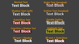
The plugin focuses on modular styling through effects that can be enabled, disabled and reordered individual effects including shadow, outline, outer glow, highlight, strike-through, and parallax-style 3D depth. making it easier to build rich stylized HUDs, menus, icons, and UI elements similar to working with layered effects in graphic design tools.
The plugin also includes a preset workflow for saving and reusing effect combinations across Stylish widgets. Presets make it easy to build a style once and apply it to other text blocks, borders, buttons, or images, helping keep UI visuals consistent across a project. They can store shared effect settings and, when enabled, component appearance such as brushes or button styles.
Stylish widgets can also be baked to texture through editor-only tool. This is useful for static UI elements, icons, or decorative widgets where you want to keep the styled look while reducing runtime rendering cost. The baked texture can then be reused like a regular UI asset in your project.
Effects Explained
Stylish UI & Text styles are built from independent visual effects that can be enabled, disabled, layered, and combined freely. Each effect focuses on a specific visual role, allowing complex text and UI appearances to be built step by step across StylishTextBlock, StylishBorder, StylishButton, and StylishImage.
Shadow
A soft, blurred shadow effect designed to add readability and depth.
Unlike the standard shadow, this effect supports controlled blur, allowing shadows to appear softer and more natural.
Parameters include:
Blur amount and blur behavior
Offset and direction controls
Fine-tuned shadow softness
Strike Through
A ready-to-use strike-through effect that can be enabled instantly without manual setup.
Designed for clarity and consistency, with additional controls beyond the standard implementation.
Additional parameters:
Height
Width
Thickness
Outline
A configurable outline effect for improving contrast and readability.
For text, it behaves like a familiar standard outline. For UI widgets and images, it adds an outline around the rendered widget shape, making it useful for icons, panels, buttons, and other styled UI elements.
Outer Glow
A dedicated glow-style effect that adds a soft outer outline, visually resembling a glow.
This effect is designed for layered styling and works well when combined with shadows or outlines.
Parameters include:
Glow size
Glow offset
Optional shadow casting
Shadow amount
Blur amount
Fringe color
Advanced blur settings
Highlight
A pre-configured highlight effect that can be enabled without manual layout adjustments.
Useful for emphasis, selection states, labels, buttons, icons, and other UI states.
Additional parameters:
Highlight width
Highlight height
Highlight brush
3D (Parallax 3D)
Creates a layered parallax depth effect that makes text and UI widgets appear three-dimensional.
This is a visual illusion made from stacked layers, not real 3D geometry.
Parameters include:
Start Color
End Color
Look At Rotation
Depth
Add Depth Offset to Shadow
Add Depth Offset to Glow
Propagate Glow To 3D Effect